Luxury Market Analyst
Handbag authentication specialist. Has reviewed submissions across Hermès, Chanel, Louis Vuitton, and Dior since 2019.
Last updated August 2026 · Published July 2026 · Contact
The Name Behind the Brand
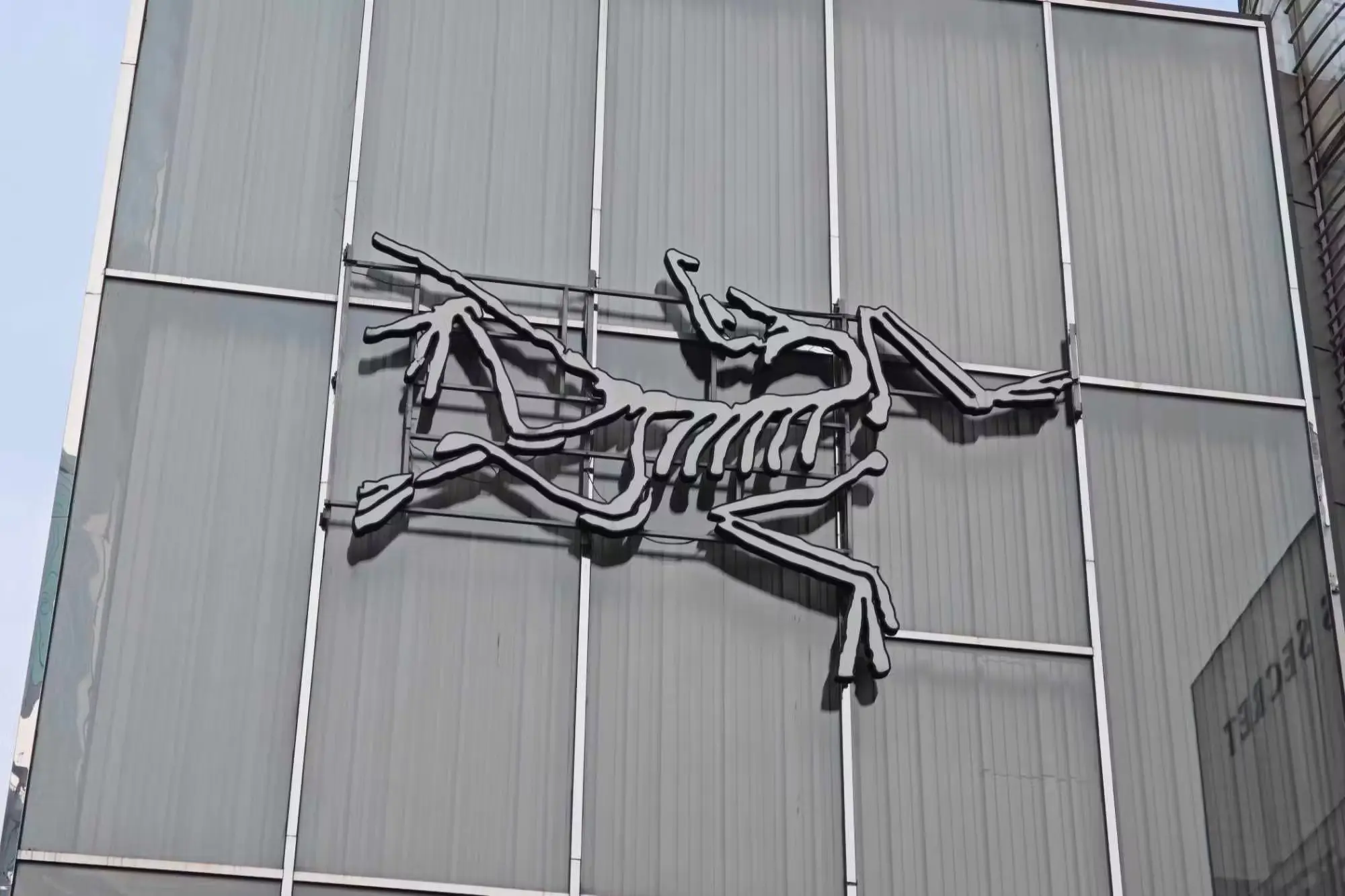
Arc'teryx takes its name directly from *Archaeopteryx*, a genus of feathered dinosaur widely considered one of the earliest known transitional species between dinosaurs and modern birds, dating to the late Jurassic period roughly 150 million years ago. The brand's stylised bird logo is a direct visual reference to this fossil — specifically to the Berlin specimen, the most complete Archaeopteryx skeleton ever recovered and the one whose splayed wing and tail impressions are reproduced in the mark.
The choice wasn't arbitrary. Archaeopteryx is scientifically significant precisely because it represents an evolutionary transition — a species bridging two very different forms through incremental, functional adaptation. Arc'teryx, founded in North Vancouver, British Columbia in 1989 as Rock Solid Manufacturing before rebranding, built its identity around a parallel idea: technical outdoor gear as a product of continuous, function-driven evolution rather than static design.
The company's origins support the metaphor more literally than most brand stories do. Rock Solid Manufacturing began by making climbing harnesses, and its early breakthrough came from thermoforming EVA foam into harness components — a manufacturing process borrowed from outside the climbing industry and adapted to solve a specific load-distribution problem. The bird arrived alongside a company already defined by incremental technical adaptation.
Why an Extinct Species Fit the Brand's Philosophy
Arc'teryx's design language has always emphasised engineering-first problem solving — minimising seams, optimising waterproofing, and refining fit through iterative technical development rather than seasonal fashion cycles. The Archaeopteryx reference reinforces this positioning in several specific ways.
Evolution through function, not decoration. Archaeopteryx's transitional anatomy existed because it worked, not because it was designed for appearance. This mirrors Arc'teryx's form-follows-function ethos, most visible in decisions like moving zips off the shoulder line to avoid pack straps, or laminating rather than stitching where a seam would compromise waterproofing.
A symbol outside fashion's usual reference points. Most outdoor and luxury brands draw on heraldry, animals, mountains, or founder initials. A specific extinct genus is a distinctly technical, almost scientific choice that signals engineering culture rather than lifestyle aspiration.
Longevity and durability. Invoking a 150-million-year-old fossil reinforces a brand message about building gear meant to last — a message Arc'teryx backs commercially through its ReBird repair and resale programme.
A deliberate barrier to casual recognition. The name is hard to spell, hard to pronounce, and requires explanation. For a brand positioning itself toward serious users rather than mass appeal, that friction was a feature.
The Logo as an Authentication Signal
Because Arc'teryx's bird logo is precise and consistent across the product line, it is one of the more reliable visual authentication checkpoints on Arc'teryx apparel and gear, alongside build quality and fabric technology markers.
What to look for on genuine hardware:
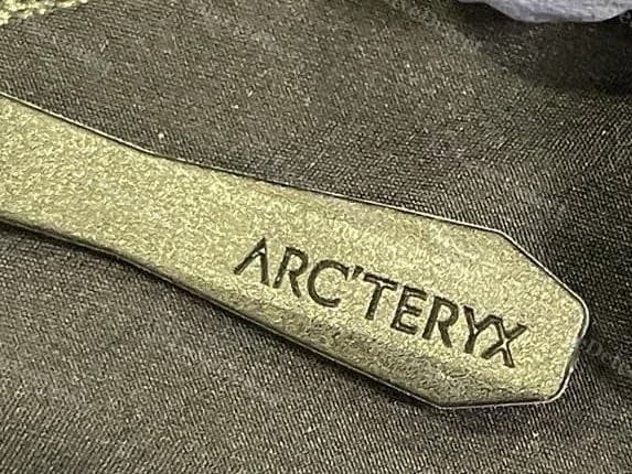
- The bird silhouette shows crisp, clean lines with no blurring or pixelation, whether embroidered (on softshells and insulated pieces), heat-transferred or bonded (on hard shells), or moulded into hardware such as zip pulls
- Proportions are consistent — the wing and tail shapes follow a specific, unchanging silhouette across collections, with the distinctive splayed primary feathers clearly separated rather than merged into a single mass
- On embroidered logos, stitch density and thread colour are even throughout, with no visible thread breaks, loose ends, or inconsistent tension
- On moulded hardware, the relief is sharp with defined edges and no flash at the mould line
Common fake tells:
- A bird silhouette noticeably thicker, thinner, or differently proportioned than Arc'teryx's standard mark — counterfeit embroidery frequently merges the separated feather tips into a solid shape
- Poor embroidery quality: loose stitching, thread bleed, or an asymmetric silhouette
- Logo placement inconsistent with the specific product line's documented standard positioning
- Blurred or pixelated printing on hardware, indicating a copied rather than original artwork file
Beyond the logo
The logo is a first check, not a complete assessment. Genuine Arc'teryx shells carry additional verifiable markers: GORE-TEX care labels with correct branding and construction codes, seam tape applied evenly with no lifting at the edges, laminated rather than stitched pocket construction on most technical shells, and a model-specific style code on the interior label that should correspond to the garment in hand. Counterfeits that reproduce the bird accurately often fail on seam tape quality, which requires industrial equipment rather than sewing skill.
Quick Reference
- Silhouette: correct proportions with clearly separated primary feathers, no merged mass
- Embroidery: even stitch density and tension, no thread breaks or bleed
- Moulded hardware: sharp relief, no mould flash, no pixelation
- Placement: consistent with documented positioning for that product line
- Beyond the logo: GORE-TEX labelling, even seam tape with no lifting, laminated pocket construction, matching style code
FAQ
What does the Arc'teryx bird logo actually depict?
It is a stylised representation of the Berlin Archaeopteryx specimen — a transitional fossil species between dinosaurs and birds — rather than a generic bird or any living species. The splayed wing and tail in the mark correspond to the fossil's preserved feather impressions.
Why did Arc'teryx choose a prehistoric animal instead of a mountain or outdoor scene like most outdoor brands?
The choice reflects the brand's engineering-first identity. Archaeopteryx represents functional evolutionary adaptation, which parallels Arc'teryx's emphasis on iterative, function-driven design over decorative or trend-based branding. It also deliberately sits outside the visual vocabulary the outdoor category normally uses.
Is Arc'teryx's logo a reliable way to spot counterfeits?
It is one useful signal among several. Logo precision — clean silhouette, consistent proportions, quality embroidery or moulding — is a legitimate first check, but should be combined with fabric technology verification, seam tape quality, and interior labelling for a full assessment. Counterfeits increasingly reproduce the bird well while failing on laminated construction.
When was Arc'teryx founded, and did it always use this logo?
The company was founded in 1989 in North Vancouver as Rock Solid Manufacturing, rebranding to Arc'teryx and adopting the bird identity in the early 1990s. The mark has been refined since but has retained its core silhouette throughout.
Where is Arc'teryx gear manufactured?
Production is distributed across several countries, and country of manufacture alone is not an authentication signal — genuine Arc'teryx is made in multiple locations depending on the product line and period. Verify against the specific style code and label construction rather than assuming a single origin.